
Custom.css Ext: Inputs Docs
Setup/Installation
Since the inputs library requires the base custom.css library, you'll need to add both.
In the head tag, just add these lines of code:
<style>
    :root {
        --kg-bg: rgb(25, 32, 40);
        --kg-fg: rgb(225, 225, 245);
        --kg-fg-darker: rgb(190, 190, 190);

        --kg-primary: rgb(30, 172, 244);

        --kg-font: Helvetica, sans-serif;
    }
</style>
<link rel="stylesheet" href="https://cdn.jsdelivr.net/gh/kgsensei/[email protected]/custom.min.css">
<link rel="stylesheet" href="https://cdn.jsdelivr.net/gh/kgsensei/[email protected]/custom.input.min.css">Adding An Input
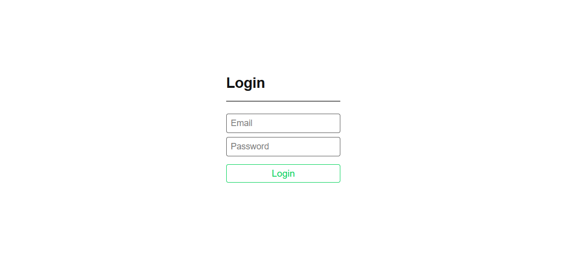
Unlike most of the custom.css libraries, the input library does most of the styling for you, by default!
And of course these can be used together with other features to make stunning login forms and whatnot:
<input id="exampleInput" type="text" placeholder="username"><form>
<input id="exampleInput" type="text" placeholder="username">
<button class="btn btn-outline primary" type="submit">Submit</button>
</form>And of course these can be used together with other features to make stunning login forms and whatnot:
Label Styles
Labels are a nice addition to any form, in the inputs library we don't have many options for them yet...If you want your label to sit closer to the top of the input itself use the
.label-low